I have a new piece up at The 74 this morning arguing that, contrary to popular perception within the education field, we do not have a generic teacher turnover crisis. Why do I say that? Two graphs help illustrate my point.
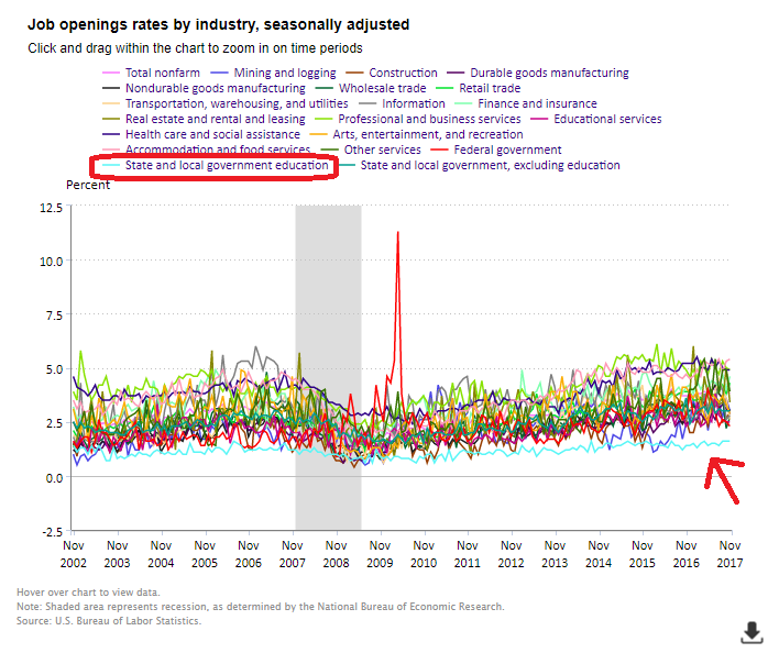
First, consider this graph from the Bureau of Labor Statistics. It shows job openings rates by industry from 2002 to 2017. I’ve added a red arrow pointing to the line for state local government employees who work in education (this group is predominantly public school teachers). As the graph shows, public education has consistently lower job openings rates than all other industries in our economy.

As I write in my piece today, “public schools have much lower rates of job openings, hire rates, quit rates, and voluntary and involuntary separations than every industry except the federal government. Across all these measures, public schools have employee mobility rates that are roughly half the national averages.”
Instead of having some sort of generic turnover problem that applies to all teachers nationally, we actually have problems that are unique to certain schools, districts, and subject areas. To illustrate this point, take a look at the graph below from the annual “Facts and Figures” report from BEST NC. It maps teacher turnover rates by district in North Carolina. Overall, the state has a teacher turnover rate that’s lower than the national average. But some districts have turnover rates about half of the state average, while others are twice as high as the average.

For more, go read the full piece in The 74 for my thoughts on what this means for the education field.
February 15, 2018
Two Graphs on Teacher Turnover Rates
By Bellwether

Share this article
More from this topic
Meeting the Moment: How 4 Philanthropic Foundations Are Stepping Up Right Now
Teaching Interrupted: How Federal Cuts Threaten a Promising Teacher Residency Program
Does Increasing Graduation Requirements Improve Student Outcomes?
No results found.